Client `DSL`
This document is part of the wercstat low-code framework (https://www.wercstat.com).
The following documents are available:
(1) Wercstat Overview: introduction to the framework
(2) Wercstat Getting Started: installation instructions and hello-world tutorial
(3) Wercstat Value Types: description of Java domain value types
(4) Wercstat Server DSL: description of the server-side Domain Specific Language
Base
constraint-set
Constraint-sets contain named constraints that can be used for layouting forms, grids and pages.
For example:
constraint-set FrameworkConstraintSet{

	layout smallText "newline, h 100:100:100, w 200:400:600, span 18"
	layout mediumText "newline, h 100:200:200, w 300:500:600, span 18"
	layout largeText "newline, h 100:300:300, w 400:600:600, span 18"
}
Contstrain-sets are currently only implemented for the desktop interface. Web-interface constrains will be available in future web-updates. |
menu
The menu keyword creates a hierarchical menu-structure.
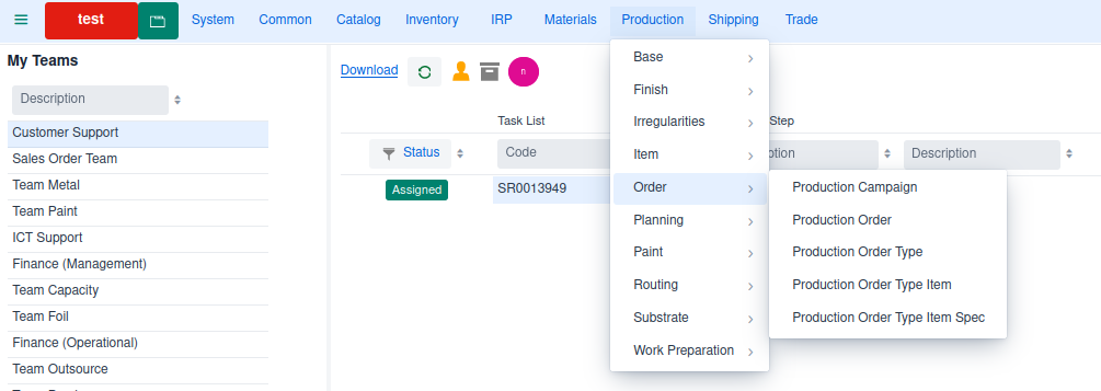
menu Menu_prd prd_Label{  (1)

	menu Menu_prd_bas
	menu Menu_prd_fin
	menu Menu_prd_irr
	menu Menu_prd_itm
	menu Menu_prd_ord
	menu Menu_prd_pln
	menu Menu_prd_pnt
	menu Menu_prd_rou
	menu Menu_prd_sub
	menu Menu_prd_wpr
}

menu Menu_prd_bas prd_bas_Label (2)
{
	page ProductionCompanyPage
	page ProductionCustomerPage
	page WorkCenterPage
	page ProductionServiceLevelPage
	page SamplePanelTypePage
	page SpecialProductPage
	page OrderPriorityPage
}| 1 | main menu that consists of references to other menus |
| 2 | sub-menu with a list of pages |
Grid
Overview
Grids have a reference to a view-model which provides all data and logic.
As the grid displays multiple records,
the view-model must be linked to an entity.
For example:
grid UserGrid editable size-full
{
	viewmodel UserViewModel

	field code frozen read-only
	field name flex-grow 1
	field accountLocked width "10em"
}
Filter
All grids have a filter row by default.
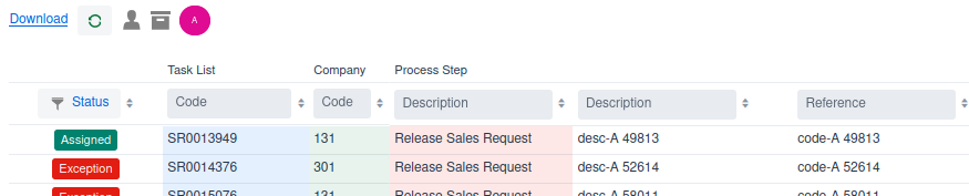
The filter row can be disabled in the page declaration. |
Enumerate fields allow filtering by selecting one or more options.
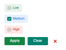
Result:
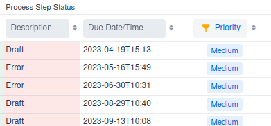
Notice that the filter-icon in the column-header is highlighted when a filter is active. |
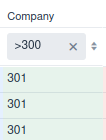
Numbers can be filtered using <, ⇐, =, >= and > operators.
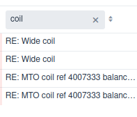
Strings are filtered using a database like method.
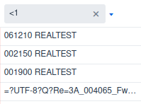
Filtering with operators is also supported:
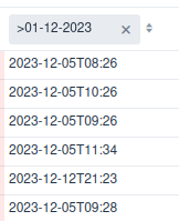
As with numbers, dates and date-times can be filtered using operators.
Sorting
Grids are sorted by business-key,
unless specified in the view-model with the order-by keyword.
Every column has an order-by button ( ) to change sorting on the fly.
custom
Adding the custom keyword to a grid declaration moves the concrete grid class
from the generated source code folder, to the manual source code folder.
field
Grids can display any field of the view-model entity,
and every reachable fields using field-paths.
Grid fields support the following options:
read-onlymakes a column read-only, even if the grid is set to
editablefrozenthe column will be visible regardless of any horizontal scrolling
flex-growa number that, if larger than 0, allows the column to automatically grow if there is space available. The number itself determines the width in relation to other
flex-growfieldswidthsets the width of the column with any
HTMLsize unit, e.g.em,chor%. Ifflex-growis0(the default) then the width is fixed as specified. In caseflex-growis set to a positive number, the column will grow more than thewidthis space is available.
|
editable
Keyword editable allows in-line grid editing of values, comparable with forms.
size-full
size-full ensures the grid takes up all available space in the container
action
Only implemented in desktop |
Filters in Java code
Filtering data within a view-model should be done server-side when possible.
If the filter involves multiple view-models then the preferred option is the ViewBinder.
Finally there is an option to send filters to the view-model directly,
using a number of predicates.
| Standard JPA filters can not be used as they are not serializable. The filter needs to be sent from client to server. |
The predicates are available as static methods on the QueryPredicate class.
Predicates
| Predicate | Description |
|---|---|
QueryPredicateCompare | field path equals, smaller / large than value |
QueryPredicateInList | filter field-path value in list of values |
QueryPredicateLike | filter field path on like value |
QueryPredicateMultiLike | filter multiple field-paths on value |
QueryPredicateReferenceKey | filter field-path on entity |
For example:
/*
 * Create predicates
 */
final QueryPredicate predicate1 = QueryPredicate.equals(
	MailMessage.DOMAIN_ENTITY_TYPE,
	domainEntityType);

final QueryPredicate predicate2 = QueryPredicate.equals(
	MailMessage.DOMAIN_ENTITY_KEY,
	longEntityKey.getValue());

/*
 * Create filter
 */
final QueryFilter filter = QueryFilter.createDefaultFilter(
	predicate1,
	predicate2); (1)

/*
 * Create order-by clause
 */
final QueryOrder order = QueryOrder.create(QueryOrderField.create(MailMessage.RECEIVED_AT, QueryOrderDirection.DESCENDING));

/*
 * Retrieve records
 */
final GetEntityRecordListRequest request = GetEntityRecordListRequest.create(
	filter,
	order,
	0, 999,
	fieldPaths);

return mailMessageViewModel.getEntityRecordList(
	EventTrace.create(),
request));| 1 | by default multiple predicates are combined with an and operator |
NamedQueryFilter
NamedQueryFilter extends QueryFilter adding the possibility to name queries
and (de-)activate the specific filters by name.
Form
Overview
A form displays information related to a single view-model.
Dirty indicator
As long as the fields on the form have not been changed,
the save button remains inactive.
The moment a value in the form is changed,
the records becomes dirty, as indicated with a dashed line around the form.
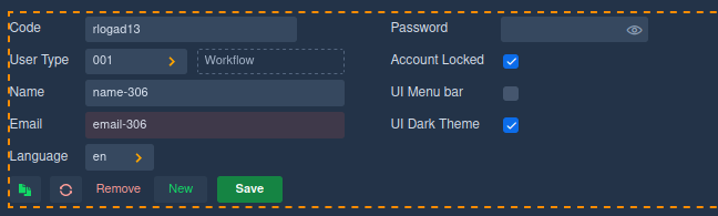
At the same time the save button becomes active.
custom
Adding the custom keyword to a form declaration moves the concrete form class
from the generated source code folder, to the manual source code folder.
read-only
read-only view-model fields can not be modified in the User Interface.
The setting is default taken from the underlying Entity, but can be
overridden in the view-model by implementing the isReadOnly method.
Note that the readOnly method must return false for both the view-model and Entity in order to update a field value.
section
A section has one or more section-columns,
and each section-column consists of a label-column and a field-column.
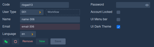
form UserForm
{
	viewmodel UserViewModel

	section s1 {
		field code
		field userType [description] (1)

		field name
		field _email
		field language

		next-column (2)

		field _password
		field accountLocked

		field desktopMenuBar
		field desktopDarkTheme
	}
}| 1 | description is a field from the UserType entity. |
| 2 | start a new column |
results in UI:
in dark theme with default toolbar:
In Wercstat this form is represented as section-columns,
which consist of two sub-columns.
For convenience reasons called the label-column and value-column.
| section-column 1 | section-column 2 | ||||||||||||||||||||
|---|---|---|---|---|---|---|---|---|---|---|---|---|---|---|---|---|---|---|---|---|---|
|
|
Notice that the value-column belonging to label User Type holds multiple components,
the input field with value 001 and the Workflow description component.
In principle any sub-column, like the label- and value-column, can contain any number of components.
By default a section-column has two sub-columns ( For example
|
label
The label keyword adds a label to the current sub-column.
form MRequestFormSO
{
	viewmodel MRequestViewModel

	section s1 {

		...

		label requestType (1)
		row {
			value requestType
			value requestType/description
			field currency
		}

		...
	}
}| 1 | label of view-model field requestType. |
renders as:

value
The value keyword adds a view-model value to the current sub-column.
form MRequestFormSO
{
	viewmodel MRequestViewModel

	section s1 {

		...

		label requestType
		row {
			value requestType (1)
			value requestType/description (2)
			field currency
		}

		...
	}
}| 1 | add business-key value of requestType |
| 2 | add value of path `requestType/description' |
renders as:
field
The field keyword adds both a label and a value to the form.
form MRequestFormSO
{
	viewmodel MRequestViewModel

	section s1 {

		...

		field referenceB (1)

		...
	}
}| 1 | add both the label and the value of view-model field referenceB to the UI |
rendered as:

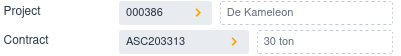
In case the field is a relation, then additional values
of the foreign-relation can be displayed.
The project field refers to table MProject,
which has a project description field.
In the user interface both the project-code and the project-description must be displayed:
form MRequestFormSO
{
	viewmodel MRequestViewModel

	section s1 {

		...

		field project [description] (1)
		field contract [description] (2)

		...

	}
}| 1 | add the label and the value of view-model field project to the UI, including the description from the project-entity. |
| 2 | add the label and the value of view-model field contract to the UI, including the description from the contract-entity. |
rendered as:
label-code
The label-code keyword renders the content of a specific label.
form DefaultToleranceForm
{
	viewmodel DefaultToleranceViewModel

	section s1 {

		...

		label-code thicknessLabel (1)
		row {
			field minThickness
			field maxThickness
			}

		...
	}
}| 1 | display the text belonging to label thicknessLabel. |
renders as:

Notice that the row displays two fields, which are rendered with both label and value in one section sub-column |
value-label
The value-label keyword displays a view-model value, as a label.
form MRequestFormSO
{
viewmodel MRequestViewModel
section s1 {
...
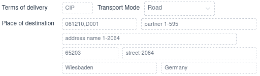
label termsOfDelivery
row {
value termsOfDelivery
field transportMode
}
value-label termsOfDelivery/termsOfDeliveryLocation (1)
row {
value deliveryAddress
value deliveryAddress/partner/name
}
...
}
}| 1 | the label of the delivery address depends on the terms-of-delivery |
In case of FCA (free-carrier) terms-of-delivery, the address is the Place of Delivery.
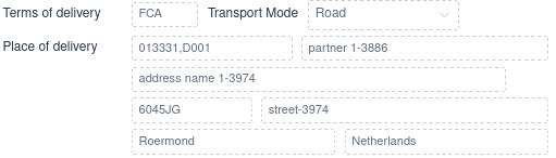
But if the user select terms-of-delivery CIP (cost-insurance-paid),
then the address is the Place of Destination.
separator
The separator has an optional label field, and adds a field-group divider to a section-column.
form IRDocumentForm {
viewmodel IRDocumentViewModel
section s1 {
...
next-column
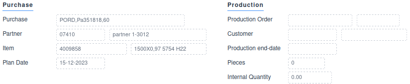
separator irPurchaseLineLabel (1)
label-code irPurchaseLineLabel
row{
value purchaseCommitment
}
label purchaseCommitment/partner
row{
value purchaseCommitment/partner/code
value purchaseCommitment/partner/name
}
field purchaseItem [description]
field purchaseReceiptDate
next-column
separator irProductionLabel (2)
field productionOrder [campaign/code]
label productionOrder/wpDocument/customer
row{
value productionOrder/wpDocument/customer/partner/code
value productionOrder/wpDocument/customer/partner/name
}
field productionEndDate
field productionQuantityPcs
field productionQuantityInt
}
}| 1 | Purchase field block header |
| 2 | Production field block header |
tab
The tab keyword tables to the next section sub-column,
for example from label-column to value-column.
It is often used to leave the label-column empty in case of related fields, like address details.
form MRequestFormSO
{
viewmodel MRequestViewModel
section s1 {
...
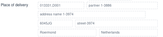
value-label termsOfDelivery/termsOfDeliveryLocation (1)
row { (2)
value deliveryAddress
value deliveryAddress/partner/name
}
tab value deliveryAddress/name1 (3)
tab row { (3)
value deliveryAddress/zipcode
value deliveryAddress/street
}
tab row { (3)
value deliveryAddress/city
value deliveryAddress/country/description
}
...
}
}| 1 | set Place of delivery in the label-column |
| 2 | start a row in the value-column |
| 3 | tab over the label-column, to add values to the value-column |
results in layout:
new-line
The new-line keyword is a carriage return for the section sub-columns.
It will reposition the cursor at the label sub-column of the next line.
next-column
Starts a new section-column, i.e. a new column with label/value rows.
row
The row keyword is the start of multiple components inside one sub-column,
like the label-column or the value-column.
form MRequestFormSO
{
	viewmodel MRequestViewModel

	section s1 {

		...

		label requestedDeliveryDate
		row{ (1)
			value requestedDeliveryDate
			field orderPriority read-only
			value orderPriority/description
		}

		...
	}
}| 1 | start a row with multiple fiels within a value-column |
This renders as:

There are additional row-types available:
lineheaderfooter
The header line type is used for order header.
form MRequestFormSO
{
	viewmodel MRequestViewModel

	section s1 {
		row header{ (1)
			value-label requestType/mtype (2)
			value documentCode
			value linkedDocuments
			value documentDate
			field company
			value biRequestStatus
		}

		...
	}
}| 1 | header row |
| 2 | Sales or Purchase, depending on the order type |
renders as:

custom-action
Only available in desktop version. |
toolbar
Overview
Tool-bars are used to combine actions in to groups, and place them on different sections in the form.
They are also an easy option to restrict the default options,
toolbar CalendarEntryToolbar{
	viewmodel CalendarEntryViewModel

	save (1)
	refresh
}| 1 | Only allow record update, no create or delete |
custom
Adding the custom keyword to a tool-bar declaration moves the concrete tool-bar class
from the generated source code folder, to the manual source code folder.
default-actions
Tool-bars support the following default actions:
create, remove, copy, save, clear and refresh.
The default-actions keyword adds all default actions to a tool-bar.
toolbar CalendarEntryToolbar{
	viewmodel CalendarEntryViewModel

	default-actions (1)
}| 1 | add buttons for create, remove, copy, save, clear and refresh. |
You can still, conditionally, hide any of these buttons in the |
archive-actions
Tool-bars can hold a special button for archived records.

when selected, the button lights up, and all archive records are included in the grid.

The archive button can be added to a toolbar:
toolbar CalendarEntryToolbar{
	viewmodel CalendarEntryViewModel

	archive-actions (1)
}| 1 | add filter button for archived records |
page
Overview
A Page combines one or more forms and grids together to form a web-page,
with a unique URL, that can be opened in the browser.
The page creates the client-side view-models, forms and grids,
and binds them together.
page UserPage userLabel{

	viewmodel UserViewModel userViewModel (1)

	view UserGrid userGrid userViewModel (2)
	view UserForm userForm userViewModel default-toolbar (3)

	segment panel1 userLabel{ (4)
		display userGrid
		input userForm
	}
}| 1 | declare view-model |
| 2 | declare a grid, and link it to the view-model |
| 3 | declare a form, and link it to the view-model. Add the default-toolbar (CRUD actions) |
| 4 | layout the grid and form onto a panel |
Exceptions
Client side logic should always be encapsulated in a try catch to
ensure no errors go unnoticed (i.e. not added to cloud message logs) or corrupt the UI.
try {

	<....>

	// Create request for records from Server
	final GetEntityRecordListRequest request = GetEntityRecordListRequest.create(
		filter,
		order,
		0, 999,
		fieldPaths);

	// Execute request and return results
	return mailMessageViewModel.getEntityRecordList(
		EventTrace.create(),
		request);

} catch (final ViewModelClientException e) {
	VClientExceptionUI.showError(labelProvider, e); (1)
}| 1 | Log exception and inform user |
Client side logic should be avoided if possible as it makes business logic UI dependent. |
custom
Adding the custom keyword to a page declaration moves the concrete page class
from the generated source code folder, to the manual source code folder.
default-parameters
Some pages are started without a selection list, just showing one record in a form.
In that case the page has to accept extra parameters: entity-key or business-key.
The page will load the record when it is opened.
This also allows, for example, to open a specific record using an URL. For example https://srv-real.xxxx/salesOrderPageSO/SR0008907 . This link can be embedded in an email or any message that accepts http-links.
page UserPageSO userLabel default-parameters{ (1)

	viewmodel UserViewModel userViewModel

	view UserForm userForm userViewModel (2)

	segment panel1 userLabel{
		input userForm
	}
}| 1 | Add page parameters for entity-key or business-key |
| 2 | Page only has a form, no grid. |
config
Only available in desktop version. |
view-model
The view-model keyword declares client-side view-models.
These models are linked to a server-side view-model.
page UserPage userLabel{

	...

	viewmodel UserViewModel userViewModel (1)

	...
}| 1 | client side view-model variable userViewModel is linked to server side view-model UserViewModel |
Any number of forms and grids can be linked to the same client view-model.
view
The view keyword links a form or grid to the view-model.
page UserPage userLabel{

	viewmodel UserViewModel userViewModel

	view UserGrid userGrid userViewModel (1)
	view UserForm userForm userViewModel default-toolbar (2)

	...
}| 1 | link grid userGrid to view-model userViewModel |
| 2 | link form userForm to view-model userViewModel |
The view keyword has additional options:
default-toolbar: addCRUDtoolbar to the viewdefault-toolbar-archive: add the archive filter button to the viewno-navigation: remove filters from grid-headerconfig: (only available in Desktop)
bind
The bind keyword binds view-models to filter result-sets in forms and grids.
page MetalPriceListPage metalPriceListLabel
{
	viewmodel MetalSupplierViewModel metalSupplierViewModel (1)
	viewmodel MetalPriceListViewModel metalPriceListViewModel
	viewmodel MetalPriceListLineViewModel metalPriceListLineViewModel

	bind metalPriceListViewModel to metalSupplierViewModel auto-select (2)
	bind metalPriceListLineViewModel to metalPriceListViewModel (3)

	...
}| 1 | declare three view-models |
| 2 | link price-list view-model to supplier view-model.
When the user selects a different supplier, the price-list grid will be updated.
And because of the auto-select keyword, the first grid-record will be displayed in the form. |
| 3 | link price-list-line view-model to price-list view-model.
When the price-list selection changes, the price-list lines will be updated. |
Note that this has a cascading effect. The user selects a new supplier, this will refresh the price-list grid and form. And because the price-list selection changes, the price-list lines will be refershed.
The bind keyword has additional options:
field. Normally the relation betweenview-models(i.e. entities) can be determined automatically by analysing the foreign-keys. However, if this is not possible, or a custom relation is required, then thefieldkeyword can be used to select a specific field in both tables.
bind-double-click
The bind-double-click keyword links a double-click on the grid
to a specific action in the view-model.
filter
The filter keyword adds a client-side filter to the data-set of a view-model.
segment
A segment declares the layout of multiple forms and grids on the page.
It has an optional reference to a constraint-set.
page MetalPriceListPage metalPriceListLabel
{
	...

	segment pane1 metalPriceListLabel (1)
	{
		display metalSupplierGrid
		display metalPriceListpageGrid
		input metalPriceListpageForm
	}

	segment pane2 metalPriceListLineLabel (2)
	{
		display metalPriceListLinepageGrid
		input metalPriceListLinepageForm
	}
}| 1 | add two grids and a form to the first page-segment (by default the left side of the page) |
| 2 | add a grid and a form to the second page-segment (by default the right side of the page) |
Java Page
Client side Wercstat provides component factories and services
to build pages that are linked to server-side view-models.
The client-page itself is standard Vaadin, for example:
A wercstat page is a standard Vaadin Page with two extra components:
a
PageServiceobject to create client-sideview-modelswhich are linked to a server-side counter part.a
VComponentServiceobject to create UI-components linked to the client-sideview-model.
@PageTitle("Sales Request")
@Route(value = "requestPage", layout = VMainLayout.class)
@PermitAll
@Page
public class MRequestPage extends SplitLayout {

	private final DefaultClientViewModel requestViewModel;
	private final DefaultClientViewModel requestLineViewModel;

	private final PageService pageService;
	private final VComponentService componentService;

	public MRequestPage(
		@Autowired final PageService pageService,
		@Autowired final VComponentService componentService) throws ClientException {

		this.pageService = pageService;
		this.componentService = componentService;

		AclAuthorization authorization = pageService.getAclAuthorization(this.getClass());

		requestViewModel = pageService.createViewModel(
			"MRequestViewModel",
			authorization);

		requestLineViewModel = pageService.createViewModel(
			"MRequestLineViewModel",
			authorization);

		pageService
			.bindView(requestLineViewModel)
			.toView(requestViewModel)
			.autoSelectFirstRecord()
			.autoBind();
	}
Wercstat provides two client side service classes:
PageServicefor general services (not Vaadin related).VComponentServicefor creatingWercstatclient components.
Java Binding
Field Binding
Component Factory
UI components are created using the VComponentFactory.
@Inject VComponentFactory componentFactory;

final TextField descriptionTextField = componentFactory.createTextField();
The factory creates simple Vaadin components.
There is no requirement to use the factory, but using it provides the flexibility to change properties of all fields on all forms.
Binder Class
UI components are bound to the view-model with "binder" classes:
TextField descriptionTextField = new TextField();

VTextBinder.bind(
	descriptionTextField, (1)
	viewModel, (2)
	"description", (3)
	labelProvider, (4)
setLabel); (4)| 1 | Vaadin component, in this case a TextField |
| 2 | A client viewModel providing the data |
| 3 | Path to select a field from the viewModel |
| 4 | Label provider, and setLabel toggle to add field caption |
VComponentBinder
The VComponentBinder service simplifies binding by automatically
selecting the correct Binder class, using the viewModel meta-data.
@Inject VComponentBinder componentBinder;

TextField descriptionTextField = new TextField();

componentBinder.bind(
	descriptionTextField,
	viewModel,
	"description");
VBoundComponentFactory
The VBoundComponentFactory further simplifies binding by creating the correct
component using the viewModel meta-data and binding it to the view-model
final Component descriptionTextField = boundComponentFactory.createAndBindComponent(
		viewModel,
		"description");
Every Page class provides a pageService instance, that gives access to
a componentFactory, a componentBinder and a boundComponentFactory. |
Form initialization
A form can contain both entity-fields and form-fields.
Binders will only request view-model values the moment an
entity-record is selected. If no record is selected, the fields are disabled.
During the construction of a form, no record is selected,
so the view-model is not queried for data.
Form fields are disabled during construction and are populated
when the view-model is initialized.
Dynamic fields are not part of the view-model but ad-hoc displayed on the screen.
This is mostly the case for foreign-entity fields.
For example:
when a view-model contains a field 'customer' of entity Customer,
the view might want to display field customer.description'.
This `description field is not part of the view-model and has to be added to the view-model
before it can be displayed on the client.
All component binding classes will automatically add dynamic-fields to the view-model.
A form with dynamic-fields may only be initialized once all dynamic-fields are added to the view-model,
otherwise the fields are not assigned a value on the server-side. |
Forms refresh can occur whenever the server side view-model changes:
after calling
initializeon the clientview-modelafter executing an
actionafter executing a list-count or list-refresh
The actual client-refresh executed depends on the ViewRefreshState of the view-model.
The ViewRefreshState can be set server-side to force a client refresh,
for example getRequestContext().desktop().refreshState().afterLoadRecord(). |
ViewModel initialization
The server view-model has an overridable method: afterInitialize.
It will be called exactly once and allows the initialization of field values.
The view-model state will be instantiated the first time data is requested.
Form UI components only refresh after a view-model event, such as load-record.
Grid components on will request data the moment they are displayed in the UI.
If there is a form on the page that has no binding to a grid,
the initialization of state must be triggered manually.
This can be done by calling initializeState on the view-model,
but also by simply loading a record if the view-model in case it it backed by an entity.
Java Authorization
Wercstat uses standard Spring Security authorization alongside the
Wercstat Access Control Lists (ACL).
Because of the Spring authorization, all pages must have an annotation to specify access rights. For example:
PermitAll
AnonymousAllowed
@RolesAllowed("ROLE_ADMIN")
The Spring Security roles are set according to the Wercstat
user roles (in the `Wercstat System` module).